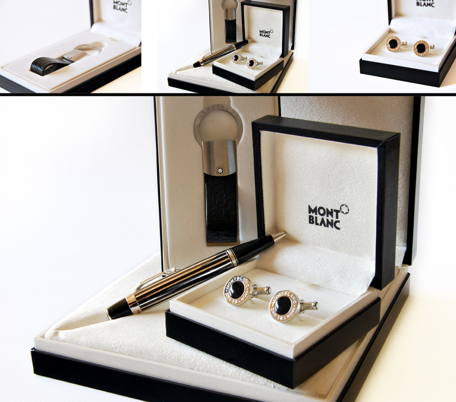
Yesterday, I was asked to take a couple of pictures of MontBlanc products. The company I work for is giving these away in a promotion.
They weren’t able to source decent images to use, and as the nature of my job entails, if you can’t get the resources you make a plan, So I spent my morning, in the office with My tripod (I don’t have a flash) trying to take decent enough images that we can use in our Tv AD.
I’m not a professional and I’m worried I’ve broken some carnal rule of photography and I will forever be punished.
That said the product of my morning above, I took tons of pictures and just picked a couple to edit quickly, I’m not sure if I over did the editing but I’m pretty pleased with the result.
This is now where I need advice from the Pros.. pretty please..





2 Comments
I think it’s good as long as you keep the Mont Blanc name in the pic! I like the white backgrounds too.
I want to add you on Facebook but there are a ton of Mandy Pietersens! Are you the one with the wedding photo of you and your hubby, and are you friends with Claire Mason (which I noticed cos I’m also friends with her)?
I agree…keep the name as that is the most important…in the one with just the cufflinks (spelling!) the focus is just a bit off, try and keep the little Mont Blanc on them in focus then blur the rest, then it wouldn’t really matter if you don’t see the big logo. But that could also just be cos the pic is small and i can’t see it properly:) i think the larger image is great and the editing as well, definitely not overdone…
Hey! comments are closed.